Daffodil Days

Daffodil Days

Daffodil Days

After the greys and browns of winter, this blaze of bright yellow is surreal. And yet, despite their vivid colour, they are very much an integrated part of the emerging spring growth. There are good years and bad years for wild daffodils. This year is a good year.  Very often an apparently random scattering of daffodils is all that remains of a cottage or farm house obliterated in the agricultural modernisation of the 1960’s.

For the bright yellow of the daffodils I used Winsor Lemon Yellow. This colour is a pure yellow without any hint of red, unlike Cadmium Yellow which I had thought of using. By using a ‘reddish’ background, provided by Burnt Sienna, and hints of blue (Cobalt) produced a contrast to the pure yellow of the Lemon Yellow. As the Lemon was the only yellow used throughout the entire painting the pure form used in the flowers was not disconnected from the general colour scheme. I have the striking yellow of the daffodils within a harmony of spring colour.

The 3 colours used are Winsor Lemon Yellow, Burnt Sienna and Cobalt Blue. The size is 12″ x 9″.

Here’s the video of the painting process, see you soon.
Moon Light

Moon Light

Moon Light

Having just passed the Spring Equinox (March 20th), the Sun and Moon vie for dominance in the evening sky. On this day, the last of the Sun’s rays were glowing in the upper atmosphere reflecting a dull eerie light. A crescent Moon cast shadows and distant street lighting sparkled through the gloom.

Its amazing how differently we perceive a ‘Moon scape’ when compared to how the camera captures it. The photograph never records what we think we see. For example, to the unaided eye the Moon near the horizon is huge and as it rises appears to shrink in size. A multi-exposure photograph shows the Moon does not appear smaller as it rises into the sky. In fact without a bit of photographic expertise the Moon will appear no bigger than a star.

Also, in low light levels, we don’t see colour. Our eyes trade off colour vision in favour of a sharp monochrome image. A ‘Moon scape’ is very much a work of the imagination. The artist, painter or photographer, must manipulate the image to match what we think we see in a Moon-lit landscape. To a greater or lesser extent, every ‘realistic’ landscape, day or night, has to be manipulated to fit the way we ‘think’ the world is.

4 colours used this time. The 3 primaries, red, yellow, blue are Burnt Sienna, Winsor Lemon Yellow, Cerulean Blue. In this painting I needed a good purple. Purple is a red/blue mix. My red/blue mix from Burnt Sienna and Cerulean Blue is a bad purple, so Dioxazine Purple is used.

Here’s the video of the painting process. See you soon.

Shortcut

Shortcut

Shortcut

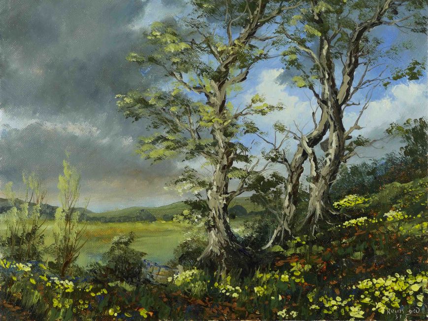
As the days pass there is an emerging greeness heralding the lush growth of spring. On sunny days the light penetrates deep into the woods.

When I paint a sky which will be overpainted later, usually with trees, I will keep the sky paint as thin as possible to reduce the interference from the under paint. I also minimise this by not using a medium and using Alkyd quick dry oil colours. However painting wet on wet means there will be a certain amount of mixing, regardless.

This is not all bad, the under colour can help in modelling the shapes of tree branches when the solvent rich colour is applied on top. Because I use a very limited palette (3 colours in this painting) the over paint is usually a variation of what is already underneath. This means there will not be a loss of chroma which happens when too many different colours come together with white in there as well.

You will notice I applied a thick layer of paint in the sky on the extreme right. This was mostly white with blue and yellow. This, of course, was very useful in giving the effect of sunlight in the fine branches and budding leaves, painted on top. Although the white underneath was still wet I was able to put a thin layer of yellow on top without too much mixing.

The yellow was Yellow Ochre and this is exceptionally transparent, so a thin layer on top of white gives a ‘glowing’ colour, a lot richer than a colour made by mixing white with Yellow Ochre on the palette. You can see this difference if you compare the yellow in the clouds and distant fields, both made by mixing on the palette.

Here’s the video of the process, see you soon.


After the Storm

After the Storm

After the Storm

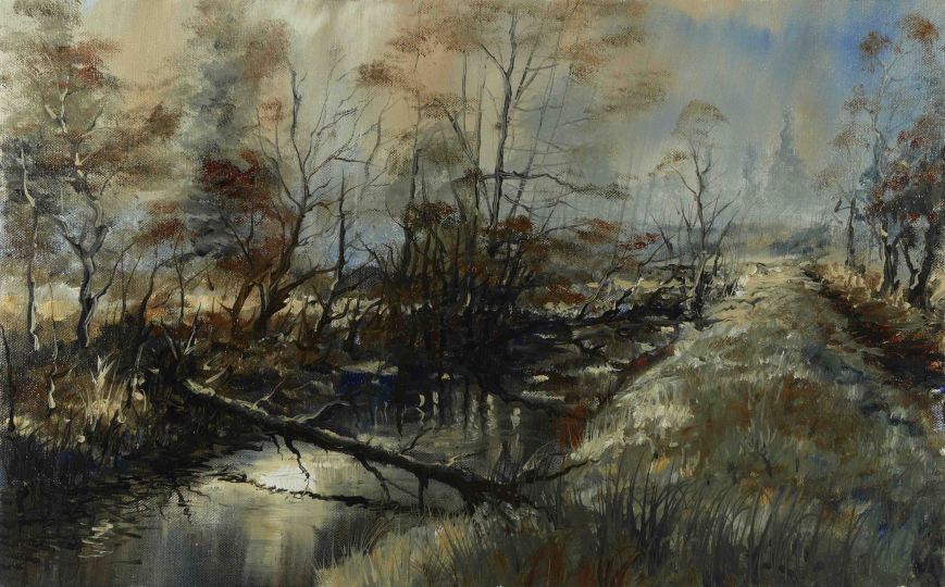
After the recent high winds, snow, sleet, hail, rain, the landscape has a ‘shredded’ look. What a change from recent days.

The colours used are Raw Sienna, Burnt Sienna and Cobalt Blue. These 3 work particularly well in winter landscapes if green is not required. Raw Sienna is too red to produce a green when mixed with a strong blue as Cobalt is. A similar colour, Yellow Ochre, will give the most natural greens, mixed with Cobalt (see here).

This painting, like the last is painted in flat ‘curtains’ of thin atmospheric colour. I used a single filbert bristle and allowed the colours to fade into the next without much cleaning of the brush. I also used variations on these background colours to suggest the buds on the trees, The filbert shape is so versatile as I switch from flat featureless distant hazes to the impossible details of trees. All lines of the graphic details of storm damaged trees were painted with a ‘liner’ (sign writers brush).

This painting is 18″x11″ and was painted in one session in under 2 hours. As usual I used no medium, only solvent, and even as I finished the painting, the dark shadows were beginning to go pale from the evaporation of the solvent. It will however spring back to life when I ‘oil it out’ in a few days.

Here’s the video of the painting process, see you soon.