‘May Chills’ – another 2 part painting

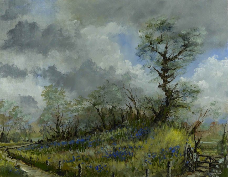
‘May Chills’

The last painting (here) was in 2 parts. The first part included sky and horizon and was allowed to dry before finishing. For a beginner this makes the task a little easier if trees and foliage are to be painted onto the sky. Painting delicate branches and leaves onto a wet sky does not allow for mistakes and corrections usually requiring scraping off, repainting the sky and trying again. A little solvent on a tissue or cloth will completely remove wet paint from a dry layer allowing multiple attempts or corrections.

This painting was completely covered in the first stage and allowed to dry – easier still. Remember using Alkyd Fast Drying Oils by Winsor & Newton in the initial stage means you can paint the second stage the following day – faster in warmer weather. If you feel the need to use a medium (I don’t) use Liquin which is also fast drying. Don’t forget to thoroughly clean the brush when finished.

Because the first stage contained some dark colours these, as usual, dried matt and consequently a little lighter in tone. Before proceeding in the second stage I ‘oiled out’ the surface by rubbing a very light coating of W&N oil painting medium into the surface with a cloth. This gives the dry painting the appearance of a freshly painted surface. This wetting of the surface will also help the application of the fresh paint. As a rule I don’t use Liquin to ‘oil out’ as it dries very fast and could seal and retard from drying, paint which was not fully dry in the under layer.

Here is a video of the process. To view in realtime change setting to .25. Quality can also be set up to 1080HD. This painting uses 4 colours (Yellow Ochre, Alizarin Crimson, Sap Green, Cobalt Blue) plus black and white. There is no medium used in the first stage, only White Spirits (Petroleum spirits). W&N painting medium was used in the second stage. 2 brushes used – No. 12 Filbert bristle & a Nylon liner. Ground is Fredrix Canvas Pad 10″x8″.

November Stream

November Stream

November Stream

What was a pathway in Summer is now a stream. Excessive rainfall has changed the landscape. The blue of the sky penetrates into this dark corner carried by the recently exposed limestones.

This painting uses only 3 colours (Yellow Ochre, Burnt Umber, Cerulean Blue) plus black and white. There is no medium used, only White Spirits. The size is 16″ x 10″.

Here’s the video of the painting process, see you soon.


October Wood

October Wood

October Wood

Golden browns against the misty blue/green of the deep woods was the inspiration for this morning scene. A lack of rainfall and wind has left the foliage on many of the trees but this is set to change, the storms are coming in from the west.

The background is painted dry and thin. The only solvent was in the initial raw blue. Yellow and white were added to produce a thin transparent gradient. The distant trees were the same 2 colours, just thicker paint and less white. In fact, the only white was what was left on the brush from the previous mix (I’m using a single brush for the entire painting). These trees had shape and definition which was lost in the blending but I think was necessary for a natural effect.

The blending of colours at this stage will make the later fine lines easier to apply. The distant leaves are brushed into the background and the white in this background colour, changes the rich browns to a softer tone. How different this is to the same colour placed on top of the background as in the foliage in the left foreground.

All paint in the later stages had quite a lot of solvent. It has to be ‘wetter’ than the layer onto which its applied, otherwise the under layer is lifted off the canvas on the brush.

As usual I used just 3 colours, Yellow Ochre, Burnt Sienna and Prussian Blue, plus black and white. I used a single flat filbert bristle and a fine ‘liner’ for the thin lines of trees and branches. The size is 12″ x 9″ and was painted in a single session of about an hour and a half.

Here’s the video of the painting process. See you soon.

Summer in April

Summer in April

Summer in April

It was short lived, and now, the landscape is being scraped by a North Westerly more vicious than anything thrown at us during the entire winter. There will be very few blossoms left on the fruit trees this spring and probably very few leaves either.

This method is a departure from my usual very wet method using solvent. The only time I used solvent was on the distant hills, the details of the trunks and branches of the trees, and the foreground grasses.

The colours are Cadmium Yellow, Indian Red and Cobalt Blue. Indian Red is similar to Burnt Sienna but more intense. When mixing yellow and blue to produce green, I usually add a little red to make a more ‘natural’ green. Indian Red does not mix well and very little goes a long way. After painting the darker shades, using a mix of red and blue, progressing to the lighter coloured greens using the same brush, without cleaning, provided enough red to ‘naturalise’ the green.

The same 3 colours are present in all areas of the painting. Its the proportions of each that produce the final colours. However, sometimes this can be a little dull so the very last brush strokes were tiny spots of the unmixed raw colours, mostly red and blue, to add a little sparkle.

Here’s the video, see you soon.

Shortcut

Shortcut

Shortcut

As the days pass there is an emerging greeness heralding the lush growth of spring. On sunny days the light penetrates deep into the woods.

When I paint a sky which will be overpainted later, usually with trees, I will keep the sky paint as thin as possible to reduce the interference from the under paint. I also minimise this by not using a medium and using Alkyd quick dry oil colours. However painting wet on wet means there will be a certain amount of mixing, regardless.

This is not all bad, the under colour can help in modelling the shapes of tree branches when the solvent rich colour is applied on top. Because I use a very limited palette (3 colours in this painting) the over paint is usually a variation of what is already underneath. This means there will not be a loss of chroma which happens when too many different colours come together with white in there as well.

You will notice I applied a thick layer of paint in the sky on the extreme right. This was mostly white with blue and yellow. This, of course, was very useful in giving the effect of sunlight in the fine branches and budding leaves, painted on top. Although the white underneath was still wet I was able to put a thin layer of yellow on top without too much mixing.

The yellow was Yellow Ochre and this is exceptionally transparent, so a thin layer on top of white gives a ‘glowing’ colour, a lot richer than a colour made by mixing white with Yellow Ochre on the palette. You can see this difference if you compare the yellow in the clouds and distant fields, both made by mixing on the palette.

Here’s the video of the process, see you soon.


Spring Light

Spring Light

Spring Light

The woods are about to spring into life. The light has arrived but the temperatures are still a bit low. At the moment the trees are bare, except for the beeches with their brown, over-winter foliage. Soon it will be green, green and more green and I will be trying to add a bit of ‘spice’ to this monotony. Its always a challenge.

I was trying to convey sunlight without the usual ‘sunny day’ look. Cool sunlight, fresh and clear. The curtain of blue (Prussian plus a little Lemon Yellow) in the background and water, dominate the scene. The touches of warm colours (Burnt Sienna, green and yellow) produce a vibrant contrast.

The painting has a graphic look created with a sign painters ‘liner’. An inexpensive nylon brush used to paint long continuous lines on signage. Trees drawn with these long unbroken lines, from the ground upwards, convey the growth patterns of trees. The loaded brush at ground level produces a thick heavy line which thins as the brush travels upwards. Its important to rotate the brush between your fingers, especially at the fine line stage. This keeps the bristles pointed, otherwise, instead of really fine lines you’ll get a ‘furry’ blur.

Remember, I don’t use a medium. The background has to be a really well brushed, thin layer of paint with solvent only added. In a few minutes the solvent evaporates and this can be painted over with the fine lines. The paint used to ‘draw’ the fine lines has the consistency of ink, produced by adding loads of solvent and ‘mulling’ the paint with the flat of the palette knife. If this paint does not contain more solvent than the surface on to which you are painting, the background paint will be lifted onto the brush with no paint will be applied. This technique irritates many traditional oil painters who like the thick, sticky consistency of oil paint.

Also remember I use Alkyd Oil Colours. These are fast drying colours and begin to ‘set’ as soon as they are applied, so the background can be painted earlier than with traditional oils.

The colours used were Winsor Lemon, Burnt Sienna, Prussian Blue plus black and white. I used a single filbert bristle and the ‘liner’ mentioned above. The solvent was Artists White Spirits (a petroleum spirit for thinning paint). The size is 13″x9″.

Here’ the video, see you soon.

Wicklow

Wicklow

Wicklow

Here is a break from the flat agricultural land of Kildare, the hills and mountains County Wicklow. This was a clear bright evening so the treatment of paint is more direct than the last few paintings which relied on tinting the final colours with what was applied as under-colour.

The painting is small, 10″ x 9′ and was painted in about an hour and a half. There were 4 colours used (Cadmium Yellow, Alizarin Crimson, Dioxazine Purple, Prussian Blue) plus black and white. There is no medium used only White Spirits. In recent paintings I’m using purple in shadows for the richness of colour. I have to be careful not to overuse it, as its a little unnatural especially in its ‘raw’ state. Mixed with yellow it produces very muted greens. Normally, greens from yellow and blue alone need a little red added to reduce that ‘artificial’ look of these colours. Purple has a red element already there so its no wonder the greens look good with the richness of a 2 colour mix.

Here’s the video, see you soon.

Woodland Light

Woodland Light

Woodland Light

I normally lay down layers of raw colour with solvent only and use the transparency offered by these washes as part of the final painting. Rich shadows, onto which the final opaque colours are painted, can achieve the depth of colour as seen in the previous painting (here).

This time I was interested in a bright, lightly coloured woodland scene. The initial colours were not the unmixed raw colour, as in previous painting, but an opaque light blue in the sky and a grey in the foreground. Solvent only was also the method of application and although the solvent evaporates quickly the paint layer will still be wet enough to mix with subsequent added paint layers. This can cause problems as the white will ‘muddy’ any attempts to paint rich shadows.

So when painting the final colours I made them darker than normal and flooded the colour with loads of solvent. In some places the colour was unmixed and picked up the lighter under colour. This was OK for mid tones, but the deeper colours were dropped in as blobs of liquid paint. In this situation the liquid tends to fill the lines left by the previous brush strokes and you can get some nice random shapes. Remember the painting will dry very flat and disappointing and will definitely need ‘oiling out’ to restore the colour.

The painting is 12″ x 9″ and the colours used were Cadmium Yellow, Burnt Sienna and Ultramarine Blue plus black and white.

Here’s the video. See you soon.

Oughaval Wood

Oughaval Wood

Oughaval Wood

If you are following this blog for more than a year you might remember this painting from last June. The posts about the painting are here and here. My art material supplier, Cork Art Supplies, are running a competition and I entered this painting. I was lucky to be selected as a finalist and the final decision on a winner will be based on the number of Facebook ‘Likes’.

The finalists can be seen here. If you have the time to have a look at the finalists please do so, and if you feel I deserve a ‘Like’, I would appreciate it.

Having said that, I hate competitions, especially for art related items. What each person likes or doesn’t in art is a personal matter and no one person is more qualified that the next to say what is good or bad. At least in this competition its a democratic decision by Facebook users. I know very little about how Facebook works, but I believe if you want to promote your work its a good place to be.

Anyway, above is the final painting and here, and more importantly, is how it was done. See you soon.

Bluebells in May

Bluebells in May

Bluebells in May

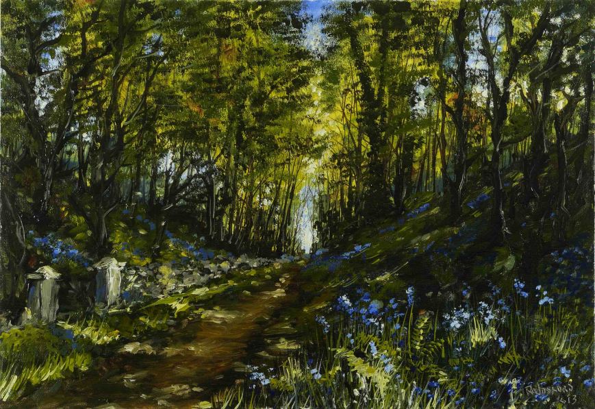
Bluebells like shade. They are happiest in the deep woods where they have little competition from other plants. Here there were trees and in their shade was a small colony of these beautiful wild flowers. After recent storms many of the old trees fell and were taken away for firewood. Its only a matter of time until these flowers are choked by the new growth of the hardier ‘light loving’ plants. The remaining bluebells are strongest in the areas of shadow cast by the surviving trees.

I painted the tree on the right by placing drops of solvent rich paint onto the wet paint of the background sky. Before the solvent evaporated I used a fine brush to drag this paint into the shapes of branches. The solvent partially lifted the under layer and as the branch got smaller and smaller the line almost faded out. This produced the most delicate branches. This effect, and the gentle application of colour onto the background sky to represent the spring growth of leaves, produced this tree ravaged by storms but still surviving and preparing for summer.

As usual I used only 3 colours (Cadmium Yellow, Burnt Sienna and French Ultramarine) plus black and white. There is no medium used, only White Spirits and loads of this. You might think that this solvent method will finally produces a painting of extremely thin and delicate paint layers. In fact the multiple layers placed one on top of the other does add up and although this effect makes an image thin and flimsy the paint is quite heavy. Remember this is all done in a single painting session, ‘wet on wet’. If individual layers were allowed to dry before proceeding to the next (traditional oil painting) all the problems associated with ‘fat over lean’ would lead to a brittle paint layer liable to crack and flake off.

On the subject of flaking off, stretched canvas is the most unstable surface on which to paint. It is in a constant state of stretching and shrinking. Linen canvas is the best for stretching but even this tightens in times of high humidity and loosens in dry conditions. Oil paint has to be flexible with a good amount of medium to survive this. So the advice to use linen and loads of medium for important paintings is sound in this situation. I mention this because many of the time honoured rules like ‘fat over lean’ and using linen only apply in certain circumstances. I mount my loose canvas onto a rigid board when the painting is dry and then I varnish it. The actual type of canvas does not matter provided it has been properly sealed and primed. So the linen or cotton rule is irrelevant. Also, the ‘fat over lean’ rule does not apply to the above method as there is only a single paint layer, applied in a single application.

Here’s the video of the painting. See you soon.