Lakeside Grazing

Lakeside Grazing

Lakeside Grazing

This is a busy time of year for me. The garden needed a complete overhaul, mostly to make it safe for visiting grandchildren. Not that there is anything dangerous lurking out there, just a few briars or nettles in the ‘secret’ places where they like to play. We sometimes forget how safe the landscape is in Ireland. There are no snakes, venomous or otherwise, or disease carrying insects like mosquitoes or ticks as on mainland Europe. Very pleasant if you don’t mind the ‘variable’ weather.

This time of year can be challenging for the painter of landscapes regarding the abundance of green. I don’t particularly like green as a dominant colour in a painting. probably because there is so much about at this time of year. Nevertheless, to represent the glory of long summer days, green is essential.

I rarely use a ‘tube’ green these days. Even the mild colours like sap or olive, seem so ‘unnatural’ and dominate the entire painting if spread about in an effort to create a uniform colour. For example if I was using a ‘tube’ green for an area of grassland I would be sure to use the same colour as part of the sky mixes. An example HERE will give you an idea of what I mean by this. This was painted 2 years ago and my method has changed a lot since then but the principal is still the same.

The green in the painting above was achieved by mixing Yellow Ochre and Cerulean Blue. You can see the same colours used in the sky to produce this same green but in the context of the sky it does not look the same. This weak ‘green’ was emphasised by the red, Alizarin Crimson.

Only 3 colours were used – Yellow Ochre, Alizarin Crimson and Cerulean Blue plus black and white. I used a single bristle filbert and a nylon liner. As usual I used only solvent and no medium.

Here’s the video of the painting process, see you soon.
Woodland Bridge

Woodland Bridge

Woodland Bridge

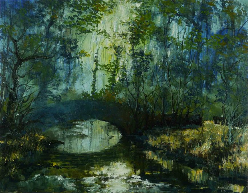
Back in the deep dark woods. We are coming to the end of a dry, hot few weeks and there is nothing like a canopy of trees to cool the air.

The effects of light in a landscape are difficult to represent in an oil painting. Watercolour and pastel are easier, each has its own qualities. Watercolour has transparency, great for glowing light, but once placed is difficult to manipulate without looking overworked. Pastels are all about smudging and blending but are completely opaque.

In this painting, I’ve used transparency in a ‘watercolour’ way and also smudged and blended as in a ‘pastel’.  The flexibility of oil painting allows a painting to be produced in this way. I have used both watercolour and pastel and even tried mixing the media in a painting but the results were not great.

As usual I’ve used only 3 colours, Cadmium Yellow, Burnt Sienna and Prussian Blue and as usual I have not used any medium. There was a lot of solvent used to produce thin washes, similar to watercolour and some paint was used with no thinning to blend and produce the effects of mist. The opaque highlights were painted sometimes with the ‘wash’ of colour and other times as a ‘dry’ daub.

Here’s the video. See you soon.

Oughaval Wood

Oughaval Wood

Oughaval Wood

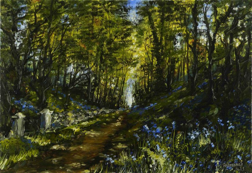
If you are following this blog for more than a year you might remember this painting from last June. The posts about the painting are here and here. My art material supplier, Cork Art Supplies, are running a competition and I entered this painting. I was lucky to be selected as a finalist and the final decision on a winner will be based on the number of Facebook ‘Likes’.

The finalists can be seen here. If you have the time to have a look at the finalists please do so, and if you feel I deserve a ‘Like’, I would appreciate it.

Having said that, I hate competitions, especially for art related items. What each person likes or doesn’t in art is a personal matter and no one person is more qualified that the next to say what is good or bad. At least in this competition its a democratic decision by Facebook users. I know very little about how Facebook works, but I believe if you want to promote your work its a good place to be.

Anyway, above is the final painting and here, and more importantly, is how it was done. See you soon.

Autumn Lake – Oil Painting

Autumn Lake

Autumn Lake

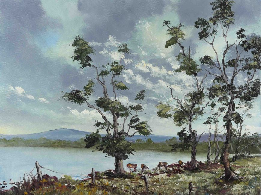
Its good to look at your paintings as a series of steps on a journey. And the best way to do this is to physically stretch them out in a chronological line and look, from one to the next, as if you are retracing your passage through time. From this perspective, patterns will be seen to emerge, some good and some you would like to change. For me it was a tendency towards dark, heavy colours and shapes which I set out to change. This is the third in this series where my objective was to raise the tone of the colours.

The colours used really don’t matter other than resisting the urge to add black to the shadow colours. In this painting the only black used was in the shadows on the trees on the left and on the boat and these were almost an afterthought to strengthen these areas.

Its a three colour painting as usual, Yellow Ochre, Burnt Umber and French Ultramarine Blue, plus white and the tiniest amount of black used unmixed in the shadows as mentioned above. The size is 16″x10″ and was painted in about 2 hours. As usual I didn’t use a medium, only a solvent (White Spirits).

Here is the painting process. See you soon.

Late Summer – Time Lapse Painting

Late Summer

Late Summer

A reader mentioned my excessive use of White Spirits solvent. His concern was the dulling effect on colours and the resultant weak paint layer, prone to cracking.  He gave a brief outline of his painting method and his particular attention to the ‘fat over lean’ principal. Very sound advice indeed if you paint in the strictly traditional method.

If Liquin or any Alkyd based media are used with traditional oils, adjustments have to be made to the working method. I will refer you to a recent post (here) regarding this medium.

With regard to White Spirits mixed with Linseed Oil or the other vegetable oils, this solvent does behave differently to Turpentine. The key issue is the viscosity of the two solvents. Viscosity is how ‘thick’ a liquid is.  Adding Turpentine to Linseed Oil lowers its viscosity, White Spirits lowers it much more. Traditionally prepared oil painting grounds are based on Linseed Oil / Turpentine absorption levels. Linseed Oil / White Spirits has a much lower viscosity and is drawn deeper into the ground carrying much of the Linseed Oil with it. The result is a dull, brittle paint layer liable to cracking. There is also the possibility of the canvas fibres penetrated by Linseed and this can cause other problems.

This is not all theoretical stuff as I noticed the difference when I stopped using Turpentine. I could not use many of the commercially available oil painting grounds, with White Spirits, as they appeared to be too absorbent. Switching to Alkyd Oils while using White Spirits was completely different – no ‘leeching’ of medium into the ground.

So why did I stop using Turpentine? Many years ago I gave classes in Oil Painting. While I didn’t have any problem with the vapour from Turpentine (I quite liked it in fact), many of the students did, getting headaches or skin rashes. We agreed to ban Turpentine from the classroom and use odourless thinners instead. Some time later Turpentine was classed as a toxic substance and since then I just never bothered using it. Odourless thinners is not always available here but White Spirits always seemed to be on the shelves of the art stores, so White Spirits it was.

Here is the painting of the above. See you soon.

Late Summer – Oil Painting

Late Summer

Late Summer

Painted in a similar fashion to the last picture, this landscape was adjusted to fit requirements. I’ve painted this scene before (here, here and here). The colours are muted compared to the previous paintings.

There are 3 colours this time, they are Yellow Ochre, Raw Umber and Cerulean Blue. I used the same colours in the last painting but also with Burnt Sienna. I felt there was no use for this red colour and actually I used very little last time. There is only solvent used, no medium. The brushes were 2 round bristles, very large and a medium sized, and also a fine nylon ‘rigger’ (actually 2 of the same size). The painting is 20″x16″, which is large for me and took about 3 hours to complete.

As usual I videoed the process and will post in a few days. See you then.

Kellyville Lake – Time Lapse Painting

Kellyville Lake

Kellyville Lake

In a recent post I talked about the lights I use to photograph my oil paintings (here). This was about the colour of the light used and the setting on the camera (white balance) used to adjust to this light. The next issue I struggled with was the position of the lights. Oil paint is wet and glossy and when it dries the colours change so its made wet and glossy again, by oiling out. Varnishing to matt, satin or gloss takes place months after the painting dries. I video and then photograph the wet painting as I’m painting, so gloss is a big issue for me.

If I was illuminating the painting for the purpose of painting only, then its fairly simple. Place the light, or lights, at a low angle to the surface of the painting and place myself directly in front. As long as the light is not coming from my direction it will not reflect back in my direction, simple.

Introduce the camera and the same applies regarding reflected gloss on the resultant video or photograph. As myself and the camera cannot be in the same position, the solution was to paint flat on a tabletop. I’m on one side looking down and the camera is opposite me on the other side of the table, also looking down. The lights are each side at a low angle so the reflected gloss does not affect me or the camera.

I see the painting right way up, of course, but the video is upside down. The simplest way of correcting this is to invert the video in a movie editor, otherwise the camera has to be mounted upside down while making the video. The video is a little bit skewed but that’s OK for a video. The photograph taken with this arrangement is also skewed and this is corrected in Photoshop but I have to be careful that Photoshop doesn’t apply a colour profile different to the one I photographed with.

So that is it. Lights, camera, action (paint a picture). Here’s the video.

Kellyville Lake – Oil Painting

Kellyville Lake

Kellyville Lake

I was here a few months ago and painted a similar piece to this (here). The landscape reminds me of the paintings of Jean-Baptiste-Camille Corot, a member of the Barbizon school of France in the mid-nineteenth century. This group of painters worked between 1830 and 1870 so they were active just before the Impressionists emerged. I looked up the paintings of Corot and was impressed by the light tones and the beautiful harmony of colour. Having seen these paintings I felt my recent work was becoming dark, even the paintings of bright summer days. This was painted to the ideals of the Barbizon school especially the paintings of Corot.

This experiment has taught me a lot about this artists working method. The main body of the painting is applied with large brushes and ‘dry’ paint dragged across the surface. The palette is limited, hence the colour harmony. Details are applied with a fine long bristled brush using a very ‘liquid’ paint. This is very similar to what I do normally. The main difference is that all my paint is applied as ‘liquid’. As you will see in the video of my painting process (next post) I reduced the amount of solvent in the earlier stages. To stop the Alkyd fast drying paint from setting too quickly I mixed some standard oil paint with the Alkyd paints. As usual I didn’t use a medium, just solvent.

The colours used were Yellow Ochre, Burnt Sienna, Raw Umber and Cerulean Blue. The size is 20″x15″ and took about 3 hours to complete.

I will have the video of the painting process in a few days, see you then.

After the Rain – Time Lapse Painting

After the Rain

After the Rain

I’ve had a few queries about photographing paintings, or how I do it. The difficulty I’ve had from the beginning was the light. Firstly, light is ‘coloured’ depending on the source. Its referred to as Colour Temperature. When I started recording videos and photographing paintings I would adjust the settings on the camera to match the light source. For example, tungsten lighting, or fluorescent. The preset settings on the camera are fine for most cases but not precise enough for what I was doing. Tungsten light varies from bulb to bulb, as does fluorescent, and this was noticeable when the same painting was photographed in different rooms using the appropriate camera preset. The photographs were slightly different. I then used a standard white card to set the White Balance on the camera (most digital cameras allows you to this). This was a vast improvement over using the presets as the light ‘temperature’ is measured and this is used as the setting.

However, I found slight differences between the image in a video and a photographic image taken at the same time with the same settings. Its to do with the way the image was recorded, as a video or still photograph. This was very noticeable using fluorescent light. Fluorescent lights flicker on and off at a rate of about 60 times per second and this is varying from second to second. A video taken at one thirtieth of a second shutter speed, should get 2 fluorescent flashes per frame, but it can be more or less, and this will affect the exposure. Its seen as black bands moving up or down the resultant video. A still photograph, taken with a long exposure of half a second, will get approximately 30 flashes in the half second the shutter is open. But this varies from photo to photo. All this flashing really confuses the automatic exposure in the camera so every setting has to be on manual.

So the solution, I thought, was to use incandescent light, like tungsten standard bulbs. These don’t flicker but the problem was heat. The lights had to be positioned in a particular way to avoid the gloss of the wet paint (more about this in the future). As I painted and recorded in a single session of about 2 hours, the heat from the lights was unbearable.

In the end I purchased 2 fluorescent photographic lights and although the manufacturer’s instructions said to set the White Balance to 4000K, by experiment I found the correct setting for the lights was 4400K. These flicker like standard fluorescent lights but at a much higher rate. So the variations are less noticeable. Now the video of a painting looks the same as the still photograph of the same painting and all paintings photographed under exactly the same conditions have the same ‘relative’ colour balance.

Having worked through this process makes me wonder about the torturous lengths painters go through to have accurate colour matching of their subjects in paintings. The colour of natural light varies from morning to dusk, from sunshine to shade or overcast. Artificial light varies with every light source. We don’t see the difference as the ‘automatic’ adjustment in our brains masks the differences. The painting produced in ‘natural’ light and hung in a gallery under artificial light are completely different in colour and we don’t notice the difference. Furthermore, no two people see in the same way and many people are partially colour blind (especially men) and they aren’t even aware of it. So much for accurate colour matching – all colour is relative.

Here is the video of the above painting. See you soon.

After the Rain – Oil Painting

After the Rain

After the Rain

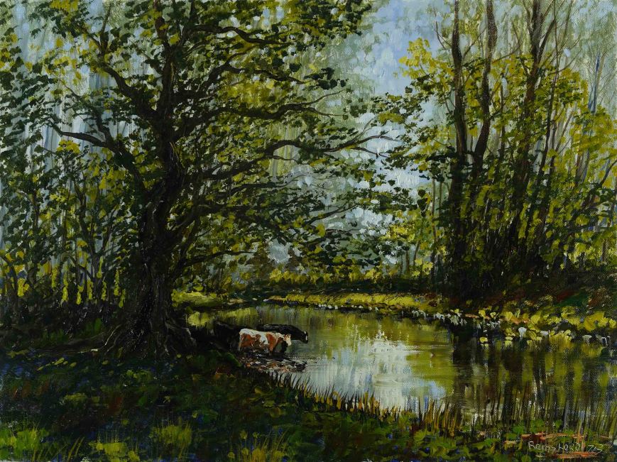
Rain, rain and more rain. I’m not complaining. The recent drought took its toll on all manner of vegetation, from grass to the mighty oaks. There was even a mini-fall with autumnal colours, in July, very strange. Now there is new growth and the rich greens of spring are here again, in July.

Viridian and Cadmium Yellow are added to the colours to convey this lush landscape. Also in there are Burnt Sienna and French Ultramarine. Just 4 colours to produce this nice harmonious landscape. Green is a difficult colour to keep ‘natural’ in a painting. As I said I used Viridian and such a strong ‘unnatural’ colour has to be moderated to produce what could be called ‘natural’. I find there needs to be a little red added. In this case the red was Burnt Sienna. I also placed pure blue, initially as an underpainting layer which was not completely covered over, and also pure raw dabs in areas where the green would be overpowering, as in the foreground here.

The composition is fairly straightforward. The centre of interest about one third in from the edge with balance restored by a smaller version of the trees on the far river bank. The effect produces a restful, non challenging layout in keeping with this rustic scene.

I videoed the painting process, as usual, and will post in a few days, See you then.