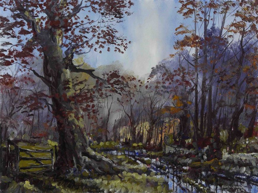
Morning Gold

Morning Gold

Morning Gold

Still a little snow here and there. I have exaggerated the amount for dramatic effect.

I used low odour solvent in this painting. It did not suit my method which uses a lot of solvent, allowing it to evaporate and building up layers of paint. A bit like a watercolour method but using solvent instead of water. This solvent did not evaporate quickly but lingered on causing all kinds of issues. It would be OK in traditional oil painting where layers are allowed to dry for a few days before proceeding. These issues relate to my ‘wet on wet’ method where the under paint must be ‘dryish’ before later layers are added. I don’t like thick ‘greasy’ paint as introducing fine lines or details is nearly impossible.

The low odour solvent has a high boiling point so it evaporates much more slowly, thus reducing the concentration of vapour by releasing it over a longer time. Its probably in the interest of safety, reducing the exposure and fire hazard. This issue arose because my usual supplier of W&N white spirits is now shipping in small containers only, again to do with health and safety. These small quantities will work out expensive but I have no alternative at the moment.

This painting uses only 4 colours (Indian yellow, Permanent Rose, Raw Umber, Cerulean Blue) plus black and white. The medium used is Liquin and White Spirits. The size is 16.5″ x 12″.

Here’s the video, see you soon.

Flooded Canal

Flooded Canal

Flooded Canal

The ordered lines and shapes of the canal are lost in the floods from the nearby river.

I used the same 3 colours as in the previous painting (Yellow Ochre, Burnt Sienna and Cobalt Blue). The sky is mostly grey. However, I did not mix my 3 colours and apply a flat layer of paint. This is so dull the entire scene would look sterile. The 3 colours are there. But by applying layers and blending with flat ‘cross hatching’ swipes while still wet, an infinite range of subtle greys are produced. The above photo does not reproduce the true variety of colours – a rainbow of tinted greys.

The painting is 12″ x 9″.

Here’s the video of the process, see you soon.

Cold Front

Cold Front

Cold Front

Cold Front is a term used by the weathermen. Its the interface between high and low atmospheric pressure. For us in Ireland, a Cold Front means nasty weather. Sometimes the change can be seen sweeping across the sky.

At the moment, the UK and Ireland are suffering from record breaking rainfall. In residential areas the floods have caused devastation – not a nice way to spend Christmas, and according to the weathermen, there’s more on the way – today. This little pasture in a normal year can provide grazing for 10 or 11 months. No so this year.

The colours I used were Yellow Ochre, Burnt Sienna and Cobalt Blue (plus black and white). These 3 are the most versatile I use and can produce the most ‘natural’ landscapes. Here are a few I’ve painted over the last few years.

October Colour

October Colour

Summer Shelter

Summer Shelter

Wicklow Storm

Wicklow Storm

Daybreak, Dollardstown Wood

Daybreak, Dollardstown Wood

These are the subjects of previous posts and can be found using the search box.

I use only 3 colours so the resultant mixes have to be good. Each colour I apply will have the other 2 colours present to a greater or lesser extent. Sometimes its only the remnants of the previous mix on the brush which alters the colours.

Note the behaviour of the blue in the skies here. Its all the same Cobalt Blue. Yet tiny amounts of the other 2 colours will not ‘kill’ the chroma of the sky blue but changes it in the most subtle way. This is more difficult with the other blues like Ultramarine, Cerulean or Prussian. I think the pigments in Yellow Ochre, Burnt Sienna and Cobalt Blue are just a good combination.

The size is 16″ x 10″. I used only solvent – no medium. For a time I was using a single bristle brush –  a large filbert. I found this OK especially progressing from one mix into the next. But a brush shape can put a pattern into a painting which I had to disguise at times so I am now using a medium sized round as well as the filbert. I also use a fine nylon ‘liner’ for thin lines and occasionally a knife for really thin lines.

Heres the video of the painting process.


Christmas Wood

Christmas Wood

Christmas Wood

Unseasonal weather has fooled the snowdrops and daffodils into the first stages of blooming. This is a month too early. The outlook is not good for a colourful spring unless the extreme mildness lasts for another few weeks and this is unlikely.

Red and green, the traditional colours of Christmas, permeate this scene. The colours uses are Yellow Ochre, Indian Red and Cobalt Blue plus black and white. I normally use these for Summer landscapes. By leaving the green colours until the end of the painting and applying this green as I would white in a typical ‘snow scene’ I avoided a summery look.

As usual I did not use a medium, only White Spirits solvent. The size is 12″ x 9″.

Here is the painting process. See you soon.

Shortcut

Shortcut

Shortcut

As the days pass there is an emerging greeness heralding the lush growth of spring. On sunny days the light penetrates deep into the woods.

When I paint a sky which will be overpainted later, usually with trees, I will keep the sky paint as thin as possible to reduce the interference from the under paint. I also minimise this by not using a medium and using Alkyd quick dry oil colours. However painting wet on wet means there will be a certain amount of mixing, regardless.

This is not all bad, the under colour can help in modelling the shapes of tree branches when the solvent rich colour is applied on top. Because I use a very limited palette (3 colours in this painting) the over paint is usually a variation of what is already underneath. This means there will not be a loss of chroma which happens when too many different colours come together with white in there as well.

You will notice I applied a thick layer of paint in the sky on the extreme right. This was mostly white with blue and yellow. This, of course, was very useful in giving the effect of sunlight in the fine branches and budding leaves, painted on top. Although the white underneath was still wet I was able to put a thin layer of yellow on top without too much mixing.

The yellow was Yellow Ochre and this is exceptionally transparent, so a thin layer on top of white gives a ‘glowing’ colour, a lot richer than a colour made by mixing white with Yellow Ochre on the palette. You can see this difference if you compare the yellow in the clouds and distant fields, both made by mixing on the palette.

Here’s the video of the process, see you soon.


Snow

Snow

Snow

Bleak and bright, this part of the woods was cleared during summer. A few evergreens survived the harvesting. The snowfall was only a dusting and was gone in a few hours.

I used a round bristle (No. 12) for most of the painting but I prefer the filbert shape. This is a flat brush with a rounded tip. Its shape allows it to be used like a round or a flat. As I’m now using a single brush this versatility is better with this method.

I used 4 colours here, Raw Sienna, Raw Umber, Dioxazine Purple and Cerulean Blue. The subtle Cerulean when mixed with Raw Sienna or Raw Umber produces those beautiful shades of green. You would expect this with the Raw Sienna but there is a definite unexpected green with Raw Umber, a brown colour.

Here’s the video of the process, see you soon.

Mist

Mist

Mist

This painting recounts that brief period as the sun rises above the layer of mist, soon to be burnt away without leaving a trace.

The painting lacks the depth of shadow I would normally apply in the early stages of painting. I used quite a lot of solvent in the mid distance and foreground. This is a bit like watercolour painting but the solvent evaporates much quicker than water. The structure of the scene was created by ‘drawing’ with a fine brush, these details to be later covered by ‘mist’, applied by dragging white over with a wide flat brush. This gave the softness and appearance of mist. The initial ‘drawing’ helped in the placing of the ‘mist’. Without these details I would probably have lost my way.

Mist is much more picturesque than fog. It hangs in low lying areas and is not a uniform blanket like fog. This of course allowed me to have a contrasting solid foreground giving a greater depth in the scene.

This small painting (12″x9″) was completed in under an hour and a half. There are 3 colours used, Raw Sienna, Raw Umber and Cerulean Blue. The details I mentioned earlier were painted with an inexpensive nylon ‘liner’, a long bristled brush used by sign writers. The rest of the painting was done with a single No.12 filbert hog-hair. You will notice I don’t clean this single brush during the painting session. I occasionally wipe off excess on a tissue, but not a full clean with solvent. Having a limited palette of 3 colours makes this work. Also I try and have the colour mixes ‘evolve’ from one into the next. So the colour on the brush contributes partially to the next colour required.

Here’s the video, see you soon.


January

January

January

Variability in our weather, here in Ireland, is probably responsible for the unique appearance of our landscape. A week or two ago we had minus degrees Celsius and snow-like frost plus a North wind, to chill us even further. Last week the temperature was a muggy 15 Celsius. This is a Summertime temperature! But not unusual for Ireland.

This changeability of temperature, in the 0 to 4 degrees range, is responsible for intense weathering. Many years ago I worked as a science technician responsible for recording the effects of this weathering on building products. The most severe damage is caused by a ‘freeze thaw’ cycle. Our colleagues in Scandinavia thought they had it bad with a few dozen cycles per year. We were counting 200-400 per winter in the early 1980’s. Nothing lasts for very long when exposed to this for a few years, and it shows in the landscape.

Ironically, within this landscape there are places, like boglands (Winter Bogland), where beneath a layer of peat, perishable items like butter, leather, wood and even bodies are perfectly preserved for thousands of years.

This painting is about the dark, damp days of this past week. Dressed for winter and trying to keep dry, against driving rain is an almost claustrophobic experience. No clean blues and purples here, as in recent paintings. The colours I used in the overall were a combination of Olive Green and Raw Umber. The combination is like a Sepia colour seen in pen and wash sketches and I stayed with this sketchy look throughout the painting.

The sky was also a sketchy effort. I painted it with John Constable’s cloud study sketches in mind.

Screen Shot 2015-01-12 at 03.39.19

Screen Shot 2015-01-12 at 03.34.38

The colours used were Raw Sienna, Olive Green, Raw Umber, Cerulean Blue, plus black and white. There is no medium used, only White Spirits. The painting is 12″x9″ and was painted with a single No. 12 filbert bristle and a small nylon liner. Painting time was a little over an hour in a single session.

Here’s the video of the painting.

December

December

December

We have not had snow, yet, but these frosty foggy days, for a few hours each day, leave a carpet of white, glowing until its burnt away by the midday sun.

I liked the contrast between the dark ragged spiky hawthorn tree and the blanket of soft white frost. As you will see in the video, I used a painting knife to draw the fine branches of the tree. No brush, regardless of how small, could achieve the sharpness of these lines on such a small painting (12″x9″).

A painting knife is specifically designed, like a builder’s trowel, to allow paint be applied without your fingers touching the surface of the painting. A palette knife is usually flat and difficult to use as a painting tool. The only time I use a painting knife is when I need a fine line, either by painting as above or scratching into the wet paint.

This painting has the same colours as the previous one i.e. Raw Sienna, Raw Umber, Dioxazine Purple, Cerulean Blue plus black and white. There is no medium used, only White Spirits.

Here’s the video of the painting process which took just under 2 hours. Excuse the slightly ‘dodgy’ clip of the painting of the river..No, I was not using 2 brushes at the same time – SD card problems while recording!

First Frost

First Frost

First Frost

Its beginning to look a lot like Christmas with heavy white frosts, the first we’ve seen this winter. The farm animals, by now, are all housed and there is very little agricultural activity on the land.

Dioxazine Purple is the underlying colour and this gives a coolness in keeping with the subject. The blue is Cerulean, a warm soft colour. The purple was used to darken the blue at the top of the sky. It was also used in the distance to add atmosphere.

When I painted the foreground, I left as much purple under-colour as possible. The green in this area is a very subtle shade produced by adding a little blue to raw sienna. This was a rich mid tone and when pure white was added to represent the frost it produced nice highlights of green.

The 4 colours used were: Raw Sienna, Raw Umber, Dioxazine Purple, Cerulean Blue plus black and white. There was no medium used, only White Spirits.

Here’s the video of the process, which took about an hour and a half. The painting is 12″ x 9″. See you soon.