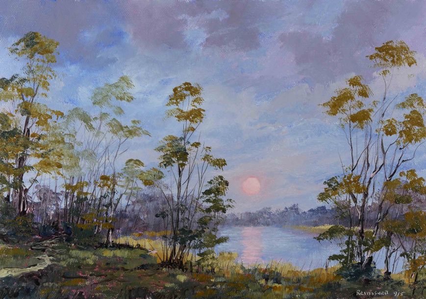
September Sunset

September Sunset

September Sunset

Colours of Autumn are here

The 3 colours, Raw Sienna, Alizarin Crimson, Ultramarine Blue, used here are transparent. The initial colouring of the canvas with thin washes was not completely covered with later opaque layers. Alizarin and Ultramarine are dark colours but as thin layers produce colours not normally associated with the oil painting technique. More like watercolour.

Some of the oil paint I use is Alkyd colour. This is a quick drying paint. The lighter colours, as in the sky, were thin layers of mostly white. This Alkyd was sufficiently ‘set’ to allow Ultramarine Blue to sit on top, again taking advantage of its transparent qualities. I mention this because its the reverse of my normal method of placing the cloud colour on top of the blue. The overall effect is bright glowing colour overall. The traditional oil painting method is to use transparent ‘dark’ colour in shadows with highlights painted with opaque bright colours.

These 3 colours (Raw Sienna, Alizarin Crimson, Ultramarine Blue) produce the most subtle secondaries. The greens, oranges and especially the purples. I used only these 3 colours and I don’t think these beautiful shades would have survived in mixes with a larger range of colours.

Here’s the video, see you soon.

Winter Sunset – Time Lapse Painting

Winter Sunset

This is more of an exercise in paint mixing and handling than in producing a painting. Specifically relating to Cadmium Yellow, a colour I’ve only recently started to use in the series of Autumn paintings, just completed. Its easy to see how this colour would suit the strong yellows and oranges of Autumn but as the Winter approaches I was wondering was there a place for this strong colour in the cooler landscapes.

The first test was to see could I place the yellow on a blue background without the usual strong greens associated with this mix. This is important for me as I’m an ‘alls prima’ painter (single session, wet on wet) and there are times when I don’t want greens occurring when blues and yellows get close together. Its the ‘wet on wet’ which causes the problems. If the blue background was allowed to dry completely, a yellow like Cadmium with a little white added to make it less transparent could be painted over the blue layer. This layer would cover the blue with yellow, and without the mixing there would be no green.

The sun on the blue worked reasonably well. A band of green around the sun would not be welcome. But the actual application of the colours was a bit restrictive (see the video below). In the reflection on the water, you can see the green from the blue/yellow interaction. Its probably OK in this area of the painting, but its not a Winter colour.

The result of this experiment is that I will not use Cadmium Yellow in the series of Winter paintings I’m about to start. It is a very dominant colour. I would have preferred to have yellow in the sky, not much but a little. But that ‘buttercup’ tinge would have ruined this cold winter sky. Without a little warmth, the blue lacks dimension, its almost monochrome. I could of course use different yellows for different parts of the painting, this is heading down the road of multiple colours and the resultant lack of harmony with richness.

Anyway, here’s the video. See you soon.

The Long Twilight – Time Lapse Painting

The Long Twilight

This technique is very much a mix of different paint applications, not the traditional oil painting method. Over the years I’ve painted in watercolours and pastels. This time for a change from my normal method I used some watercolour and pastel handling methods. Of course its not exactly the same, and not something I would do on a longterm basis.

There are thin liquid washes of White Spirits with fine details painted over the ‘dry’ washes as in watercolour. Because of the medium in the oil paint, the washes are not fully dry as in watercolour, nevertheless, the effect is similar.

Also used is an application of paint similar to pastel. The colour is applied flat using the texture of the canvas to remove the paint from the brush. Sap Green is applied in this manner on the trees. Pastel colours are not mixed, each colour and shade are a separate paint stick, which is drawn directly on the textured paper. So it was with this green. Again, because the under-colour was still not fully dry there was a certain amount of mixing.

Sap Green is one of the few green colours that can be used in this way. Its very transparent, for this reason its dark in tone in the thick layers and lighter when the layer is thin. So when the wide brush containing pure Sap Green is dragged over the surface of the painting a range of green tones are produced. Add to this the mixing with the wet under-painting and an infinite variety of colours are produced.

The ‘painting’ of the moon was actually paint removed with a fine brush moistened with spirits. The circular shape was pressed onto the canvas using a strip of waste canvas rolled into a cylinder. I roll the piece into a cylinder until the diameter is what I need. A compass would seem to be the best way of doing this but the solid piece of canvas can be felt and the diameter seen as a solid circle. Its difficult to draw a perfect circle so this is my quick way of getting a circle at the correct size.

Here is the video of the painting process. There is more on this painting here.

The Long Twilight – Oil Painting

The Long Twilight

There’s a little chill in the air to remind us that winter is coming. However there will be a period of changeover when, from one day to the next we can get summer or winter conditions. This seasonal transition is reflected in the individual days where daytime and night overlap in twilight. The most unusual sights are to be seen in the landscape at twilight, sometimes almost unbelievable and can be dangerous for the landscape artist. As I’ve said before, natural phenomena are unsettling in paintings. But not so in photographs, which as we all know, nowadays, can be as ‘creative’ as paintings. Very strange!!!

A limited palette as usual was used. Burnt Sienna, Yellow Ochre, Prussian Blue, plus Sap Green. As with the last painting I did not add any medium to the paint, just White Spirits to apply the paint in washes. I have been using this technique quite a bit lately. It allows great control of detailing, plus there are ‘accidental’ flows of paint, like with watercolours, can add interesting shapes.

Brushes used

The picture size is about 16″ x 22″. This is bigger than my usual size. The ‘solvent only’ technique is faster than the normal method. Nevertheless, I use larger brushes with larger paintings. This means I’m scaling up my working relationship between brush and area to be covered. This relationship is central to the working method. A bigger canvas with the same size brushes would need an adjustment in the working method.

I’m working on the video which is a few minutes longer than usual. A bigger painting takes more time to complete. See you soon.

Bunbury’s Bridge – Oil Painting

Bunbury’s Bridge

The scene is near where I live. The bridge spans the canal, south of the town of Athy. I don’t know why this bridge is named ‘Bunbury’s’. The bridge is disused now as it was on the entrance to Kilmoroney House which is now a ruin. Kilmoroney House was built before the canal arrived here in 1791, so the bridge was probably built at the expense of the canal company as it crossed the entrance to the house. Its possible Bunbury was the contractor who built the bridge.

This week we had 24 hours of rainfall, non stop. One average month’s rainfall, in one day. Now the sun is shining again, and after the recent rain the air is clear and its extremely hot. This affects the colours in a sunset. The last post also featured a sunset with the colours we are more familiar with – reds, oranges and yellows. This sunset is after the rain and the colours are very muted. This is reflected in the palette of colours used. There are still only 5 colours used and they are the same as the last painting [Cadmium Red (red), Cadmium Yellow (yellow), French Ultramarine (blue). Viridian Green, Raw Umber] EXCEPT Cadmium Red is replaced with Burnt Sienna.

The composition would appear to break one of the basic rules, which is ‘never put the centre of interest in the centre of the painting’. The bridge is dead centre and other elements are ‘see-sawed’ either side of this pivot. Its hard to plan this type of structure before starting to paint the picture. It has to be constructed almost like putting children on a see-saw. Two five year olds on one side will weigh the same as one ten year old on the other, or so you think. When the ten year old is outweighed, you add another three year old beside him, but now these two outweigh the other two, and so on, if you follow my drift.

So it is with this type of composition. The large tree was supposed to balance the tow-path and smaller trees on the left. It was too heavy, so I put a gap in the line of trees to add more interest and give extra ‘weight’ on this side. It did, but too much. So more detail on the near right was added… and so on… and so on. Its more time consuming as constant reworking of already painted areas can go astray if concentration is lost. The total time of painting was about three hours. A lot of time was spent just looking at the painting, the actual time of painting was under an hour and a half. I can tell this from the video recording, which I will have in the next post. See you then.

‘Alla prima’, a nice way to paint

Skellig Michael

This ‘quick painting’ was a welcome relief from the previous painting. I was planning to do a 1 hour painting but forgot that the slightly larger size (20″x14″) just eats up the time and it took 2 hours. But a nice change to have a painting complete (well almost) in 1 session.

I got to thinking about the limitations of ‘alla prima’ especially painting on top of wet paint. One time I would use solvent only in the initial layers which would evaporate leaving a very thin layer of paint, easier to paint over. Now I mix Liquin, with very little solvent, with the paint and brush the layer vigorously. This makes the layer tacky and easier to draw with the brush on top. A little planning in advance to work out the areas to apply the initial layer is helpful. This will be seen in the video which I will be posting in the near future.

All that remains to be done with this painting is a little ‘glazing’ on top of the foreground water to deepen the colour and make it richer in colour. A little work on the ‘shape’ of Skellig Michael, that’s the little island on the horizon, to make it more recognisable. By the way, the foam left after a wave, behaves like the suds on top of a basin of soapy water. It disperses in circles surrounded by lines of foam. (If you want to check this out, be careful to do so in private, as staring into a basin of dirty washing up water is not good for the ‘arty’ image). Ahem!, just thought I’d mention that, anyway the glazing will re-establish this pattern of circles.

I hope to have the time lapse video ready for the next post.

The under / over exposure problems in photos

The eye is a marvelous piece of equipment. Working away making adjustments to the image in front of us without us even been aware of it. When we look at a sunset, with the naked eye, we see all parts of the scene in most cases. The iris closes when we look at the setting sun and clouds allowing us to appreciate the fantastic colours. The iris then opens when we lower our gaze and we see the details of the landscape.

Yet the limitations of photography over the last 100 years has established the representation of sunsets in photographs and even paintings as silhouettes against a brilliantly lit sky. We accept it without question.

Digital photography can change all this. We can now represent a sunset in a picture as we would see it in real life. It means a bit of work afterwards in the computer but its well within the scope of the amateur photographer.

Sunset, Inis Oir (the smallest of the Aran Islands off the coast of County Galway).
When photographing a scene which has a very bright part and a very dark part the camera’s automatic exposure control will compromise. For example, the sky will be slightly overexposed and the ground underexposed. If the photo is opened in Photoshop the ‘Highlight/Shadow’ control can correct this and it does a great job. But it can have the ‘digitally altered’ look which is OK most of the time and I suppose is a good ‘quick fix’.

This photo had a great sky which was ‘burnt out’ when I adjusted the camera’s exposure to show the details in the foreground. When I reduced the exposure to correctly expose the sky the ground was a black featureless mass.

The solution was to take 2 photos at almost the same time. One to correctly expose the sky and the other to correctly expose the ground. Take the 2 correctly exposed bits and fit them together. Simple, if  you have Photoshop or similar. Happily, there are loads of inexpensive applications available nowadays, because of the popularity of digital photography, that are capable of doing this.

If you give it a try, remember, as you will be a little out repositioning the scene after you adjust for the second shot take more of the scene than you want at the start (wider lens setting) with the intension of cropping back when finished.

Sandwich the 2 photos in Photoshop with the white sky photo on top. You can easily select this white sky bit with the magic wand tool. Delete the sky. The sky in the under photo will now be seen. Slide the upper photo around till the horizons match up. A little bit of fiddling around the edges might be needed.

P.S. Some of the more sophisticated cameras have a feature called ‘bracketing’. This allows you to specify a range of photos each side of the ‘correct exposure’. With this setting enabled, as you press the shutter the camera takes the photo at the ‘correct exposure’, then will continue to take photos at progressively darker and lighter exposures. Depending on your settings and camera you could have 3, 5 or 7 photos going from light to dark. In many cases this range is sufficient to allow you to have the best of 2 of these photos. The advantage of this is it all happens in 1 or 2 seconds without you having to made adjustments between the shots.